T
↗
T
↗
The label can mean anything, gives the creator almost nothing to act on, and by its own definition reads a lot like human slop. What matters is what you do with it.
R
↗
"Verbalized Sampling: How to Mitigate Mode Collapse and Unlock LLM Diversity" This paper was accepted to ICML this year. Its main idea is a very simple prompt-engineering trick: "changing the prompt this way led to more diverse sampling". Naturally, it is difficult to provide a rigorous theoretical analysis for something like this. Even if it works, I’m not sure this kind of prompt engineering belongs at a top-tier machine learning conference. Some people seems to call this kind of work “modern machine learning”, but I think it should be categorized as less technical venues. How do you think? Am I being too rigid? submitted by /u/Mean_Revolution1490 [link] [Kommentare]
 C
↗
C
↗
Commoncog uses a unique case approach to business education. What it is, how it works, and why it’s superior to the traditional case method.
R
↗
So i'm on edge here everyone. bought it march, just under 70k. guy on youtube said it couldn't go any lower and all the news articles all said 100-200k this summer. figured it would be cool to make a couple grand real quick. i was up the first week or so, and it felt good, but as it stands i'm $13k in the hole and could use some objective advice. don't laugh bc i'm new to this. have collected coins forever but getting bored with them and thought this bitcoin thing would be cool but i'm beside myself for last month straight. is it possible it could go down drastically more, or do the pros know if its going to go up this week. FMLLL. wife pissed. she thinks we're only $3k down and thats freaking her out. IDFK. sorry for the vent. feck. submitted by /u/United-Swan-3288 [link] [Kommentare]
 G
↗
G
↗
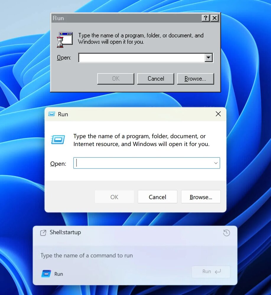
nikitonsky: How UI degrades over time.Top (Windows 95): great contrast, obvious shapes. Instantly readable.Middle (Windows 11): shapes are still self-explanatory, but contrast is gone.Bottom (Windows 11 Insiders): what am I even looking at? The only shape I can understand here is the Run button. Barely visible, though. Then, on the left, there’s another something that says Run and has an icon. What is it? A window title? Another button? Why does it have to say Run twice?Shell:startup looks like a header but from what I understand is actually your previous command. Also, why is it aligned so poorly? Text to icon, bottom padding?Finally, the text input. Do you see it? I don’t. But it’s there. The only hint is a barely visible white (???) cursor before the placeholder. How do we know it’s a placeholder? We don’t.The original Windows 95 interface is _functional_. It has a function and it executes it very well. It works for you, without trying to be clever or sophisticated. Also, it follows system conventions, which also helps you, the user.I’m not sure whom the bottom interface helps. It’s a puzzle, an art object, but it doesn’t work for you. It’s not here to make your life easier.Bottom image source: x.com/phantomofearth/status/1996660509027062148#Windows #Affordance #Contrast #Run #Dialog #MicrosoftDecember 6, 2025 // PermalinkEdit
 P
↗
P
↗
Discover what's actually good. Compare anything. You decide what's #1.
 S
↗
S
↗
Replace guessing with grounded answers. Every claim cited, every cohort sized, every uncertainty named.