 Link preview
I think the bottom is close
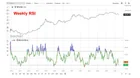
There seems to be a lot of fear, uncertainty, and doubt (FUD) surrounding Bitcoin on social media right now. Maybe the algorithms are feeding it to me based on my interests, but I’m seeing bearish takes everywhere. Many of the charts being shared suggest we should expect a much deeper drawdown, often citing previous market cycles as evidence. Others argue that the decline will continue for months, again pointing to historical patterns. When I look at the data myself, however, I come away with a very different conclusion. For example, I pay attention to the weekly RSI chart. RSI is a momentum indicator that helps measure whether an asset is overbought or oversold. Looking back, there have only been a handful of times when Bitcoin's weekly RSI reached oversold levels. Each occurrence happened near the bottom of a major cycle, and each was followed by a significant recovery. Sometimes the rebound started almost immediately, while other times it took a few months. Regardless, it has historically been a strong signal that the worst of the decline was likely behind us. I also see many people pointing out that Bitcoin has “only” fallen around 50% from its previous high and arguing that it should drop much further because past bear markets experienced larger percentage declines. The problem with that comparison is that it ignores how Bitcoin’s volatility has steadily decreased over time. Bitcoin is a much larger and more mature asset today than it was in 2015 or even 2018. If the upside moves are becoming less extreme, why should we automatically assume the downside moves must match the percentage declines of prior cycles? To me, that logic doesn’t hold up. Then there are the trendline charts. Some of the lines I see being drawn seem completely arbitrary. In some cases, people are connecting only two points and treating the result as a meaningful trendline. Personally, I put much more weight on trendlines that have been tested multiple times. The chart I shared is the only major trendline I see that has been touched three separate times before the current price action. Based on the historical indicators I follow, I don’t see a compelling reason for panic regarding continued downside. In fact, I see several signals suggesting that we may be much closer to the bottom than many people realize. Of course, history repeats itself….until it doesn’t. Nothing is guaranteed. But based on what I’m seeing, I remain optimistic. submitted by /u/Kitchen_Net_GME [link] [Kommentare] reddit.com · reddit.com
Link preview
I think the bottom is close
There seems to be a lot of fear, uncertainty, and doubt (FUD) surrounding Bitcoin on social media right now. Maybe the algorithms are feeding it to me based on my interests, but I’m seeing bearish takes everywhere. Many of the charts being shared suggest we should expect a much deeper drawdown, often citing previous market cycles as evidence. Others argue that the decline will continue for months, again pointing to historical patterns. When I look at the data myself, however, I come away with a very different conclusion. For example, I pay attention to the weekly RSI chart. RSI is a momentum indicator that helps measure whether an asset is overbought or oversold. Looking back, there have only been a handful of times when Bitcoin's weekly RSI reached oversold levels. Each occurrence happened near the bottom of a major cycle, and each was followed by a significant recovery. Sometimes the rebound started almost immediately, while other times it took a few months. Regardless, it has historically been a strong signal that the worst of the decline was likely behind us. I also see many people pointing out that Bitcoin has “only” fallen around 50% from its previous high and arguing that it should drop much further because past bear markets experienced larger percentage declines. The problem with that comparison is that it ignores how Bitcoin’s volatility has steadily decreased over time. Bitcoin is a much larger and more mature asset today than it was in 2015 or even 2018. If the upside moves are becoming less extreme, why should we automatically assume the downside moves must match the percentage declines of prior cycles? To me, that logic doesn’t hold up. Then there are the trendline charts. Some of the lines I see being drawn seem completely arbitrary. In some cases, people are connecting only two points and treating the result as a meaningful trendline. Personally, I put much more weight on trendlines that have been tested multiple times. The chart I shared is the only major trendline I see that has been touched three separate times before the current price action. Based on the historical indicators I follow, I don’t see a compelling reason for panic regarding continued downside. In fact, I see several signals suggesting that we may be much closer to the bottom than many people realize. Of course, history repeats itself….until it doesn’t. Nothing is guaranteed. But based on what I’m seeing, I remain optimistic. submitted by /u/Kitchen_Net_GME [link] [Kommentare] reddit.com · reddit.com
There seems to be a lot of fear, uncertainty, and doubt (FUD) surrounding Bitcoin on social media right now. Maybe the algorithms are feeding it to me based on my interests, but I’m seeing bearish takes everywhere. Many of the charts being shared suggest we should expect a much deeper drawdown, often citing previous market cycles as evidence. Others argue that the decline will continue for months, again pointing to historical patterns. When I look at the data myself, however, I come away with a very different conclusion. For example, I pay attention to the weekly RSI chart. RSI is a momentum indicator that helps measure whether an asset is overbought or oversold. Looking back, there have only been a handful of times when Bitcoin's weekly RSI reached oversold levels. Each occurrence happened near the bottom of a major cycle, and each was followed by a significant recovery. Sometimes the rebound started almost immediately, while other times it took a few months. Regardless, it has historically been a strong signal that the worst of the decline was likely behind us. I also see many people pointing out that Bitcoin has “only” fallen around 50% from its previous high and arguing that it should drop much further because past bear markets experienced larger percentage declines. The problem with that comparison is that it ignores how Bitcoin’s volatility has steadily decreased over time. Bitcoin is a much larger and more mature asset today than it was in 2015 or even 2018. If the upside moves are becoming less extreme, why should we automatically assume the downside moves must match the percentage declines of prior cycles? To me, that logic doesn’t hold up. Then there are the trendline charts. Some of the lines I see being drawn seem completely arbitrary. In some cases, people are connecting only two points and treating the result as a meaningful trendline. Personally, I put much more weight on trendlines that have been tested multiple times. The chart I shared is the only major trendline I see that has been touched three separate times before the current price action. Based on the historical indicators I follow, I don’t see a compelling reason for panic regarding continued downside. In fact, I see several signals suggesting that we may be much closer to the bottom than many people realize. Of course, history repeats itself….until it doesn’t. Nothing is guaranteed. But based on what I’m seeing, I remain optimistic. submitted by /u/Kitchen_Net_GME [link] [Kommentare]
Comments